Scrl: New user onboarding

Scrl is a unique iOS app that enables users to create panoramic photo collages specifically designed for Instagram.
In this project, I had the opportunity to work on the onboarding experience aimed at helping users feel at ease and quickly grasp how to use the app.
Role: UX designer • Collaborators: Co-founders & Social media specialist
Customer retention is the new conversion •
Customer retention is the new conversion •
Increasing retention
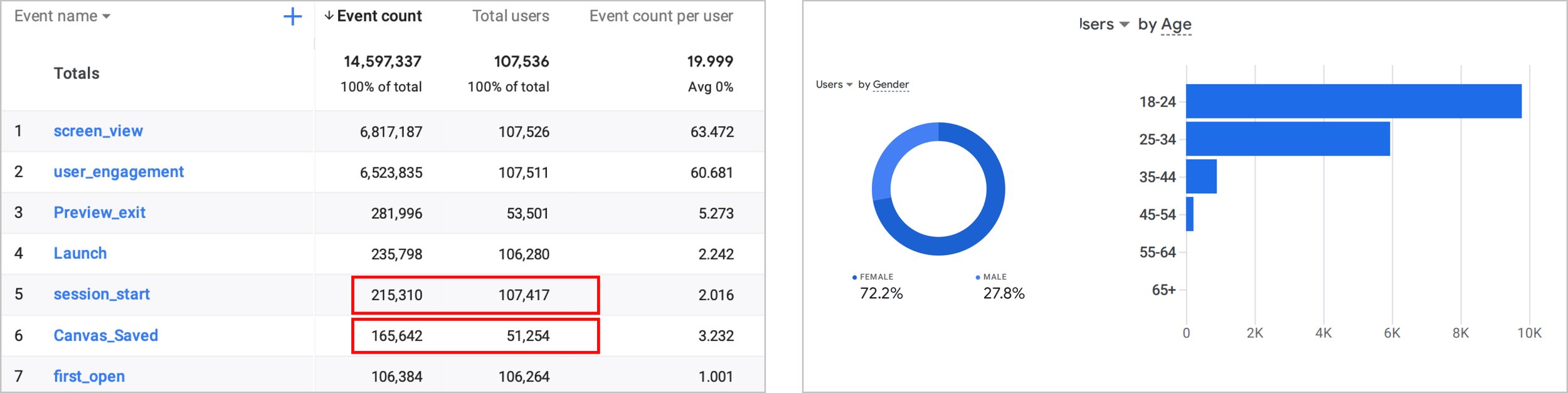
In early September 2020, Scrl was excited to introduce its first subscription model. However, the company had concerns regarding its performance as it struggled to retain first-time users. To better understand their concerns, I dove into their analytics data and put myself in the shoes of the co-founder.
Surprisingly, over 50% of users who downloaded the app never engaged with it or created an initial design project. This left me deeply concerned and left me asking…
“Why would users download the app, if they didn’t intent to use it?”

A world pandemic
We encountered our first major obstacle when COVID-19 cases were at an all-time high in Los Angeles, and participants hesitated to participate in face-to-face usability testing (for good reasons).
Our budget didn't permit remote testing tools, so how might we observe how first-time users interacted with our product?
Friends, how many of us have them? 🎶 - Whodin
After many conversions with friends and peers, I discovered a cool technique utilized by MailChimp 🙉 . They would ask participants to position the laptop camera towards their phone cameras to make remote testing possible. Genius!
I think we’re on to something
The result from the usability test showed that while Scrl was easy to use once participants were familiar with it, many non-designers or non-creatives struggled to get to that point, discouraging them from continuing to explore the app.
These participants encountered three main challenges due to user error and UX-related issues.

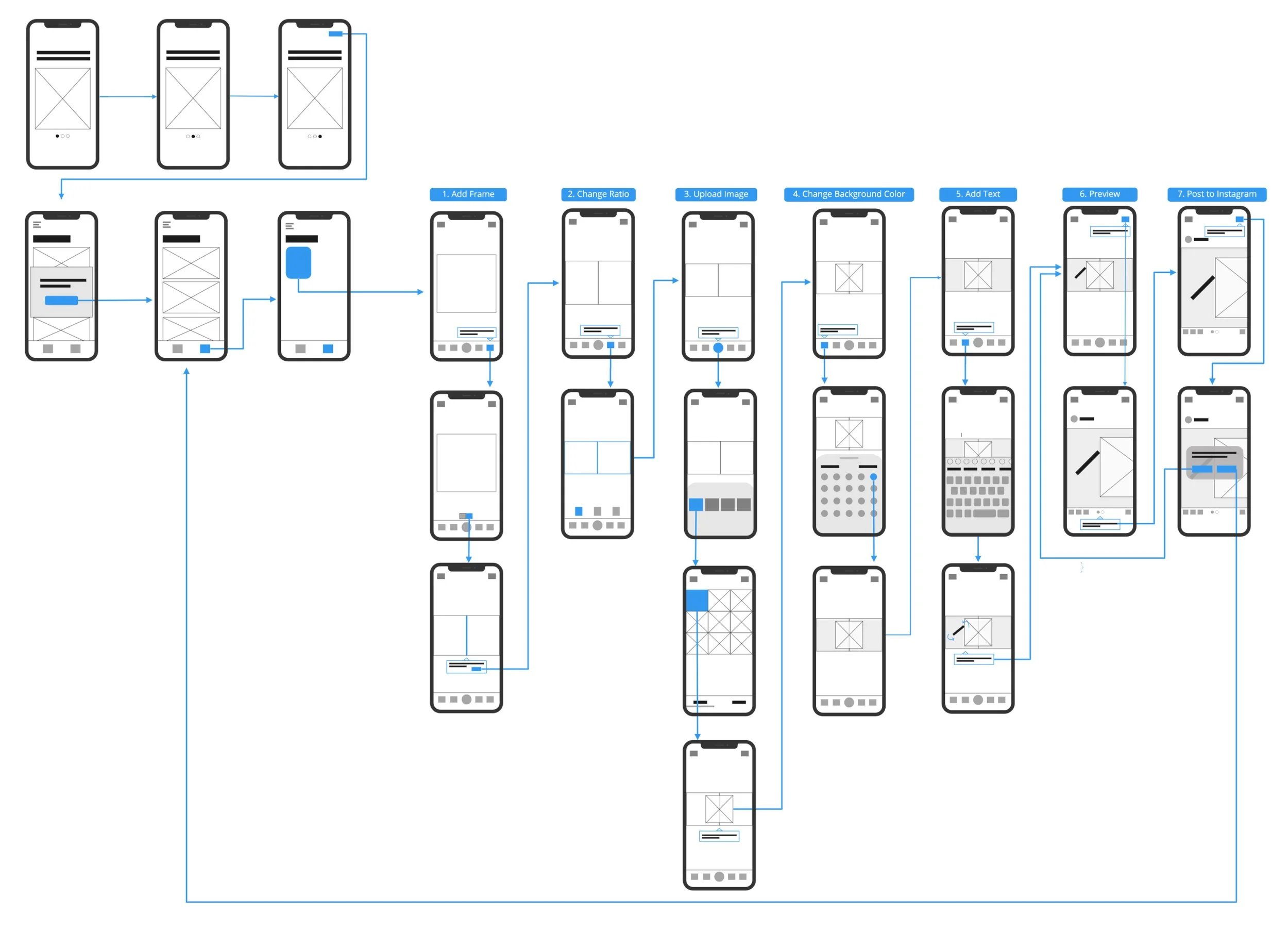
By creating a step-by-step onboarding process that guides users through their first photo collage, we can demonstrate Scrl’s ease of use, spark a sense of creativity, and encourage users to explore further. 💡

Onboarding ideation
When designing the interactive walk-through, I realized the significance of considering our users' attention span. If the walk-through design is not well-balanced, it might lead to a further decline in first-time users returning to the app. To overcome this challenge, I focused my design on two main principles:
1. Allow users to freely opt out of the guided walk-thru to explore the app.
2. Address the three main tasks the user struggled with during the usability test.
Developer hand-off


Two-sided story
To determine the best approach, we deployed two versions of the experience. One version offered an interactive walk-through that users could opt out of, while the other required users to opt in.
In both versions, users engaged in the interactive walk-through, resulting in an increase in saved collages. Yay!!
But . . . there’s always a but . . .
There was a decrease in subscription purchases that provided pre-designed templates🤦🏻♂️. My theory was that if users learned the essential tools using a blank canvas, it would encourage them to subscribe as they now understand how to build upon the templates.

Pop the champagne, Scrl
In May 2021, Scrl was acquired by Apostrophe, which led to the discontinuation of the project, as well as my time. I had an amazing experience working at Scrl with the co-founders, previously employed at Facebook (now known as Meta 😉). This opportunity taught me much about product strategy and design - which accelerated my growth as a UX designer.